In a seminar at the American Institute of Architects annual
convention last May, architect Deborah Pierce asked people to stand if they or
someone they knew lived with a physical challenge. Roughly 70 percent of the
audience stood up, a reminder that this reality should influence the way we
design our homes, even if the moves are subtle. Smart design recognizes that difficulties such as poor
eyesight, knee and shoulder injuries, and cardiopulmonary issues are part of
the human condition and if we pay attention, our homes will be more widely
usable, says Pierce, a principal at Pierce Lamb Architects, Boston, and the
author of The Accessible Home
(Taunton, 2012).
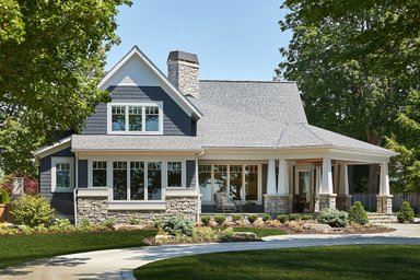
“It means being willing to do things differently, challenging conventional wisdom about such features as 36-inch countertops, 14-inch tub heights, recessed ceiling lights, and so on,” she says. Here are some of Pierce’s suggestions (cover house and photo, LDa Architects).
Siting the house
Place it at an elevation that requires minimal step-up to the entry. Shorten the walkway from the driveway to the house. Position it to take advantage of the sun’s path for abundant daylight inside.
Above, a gentle stairway and looping ramp make for an entrance that's accessible to all—whether using a wheelchair, a baby carriage, rolling luggage, or a walker. A low curb at ramp edges prevents users from slipping off into the landscape, and prevents the landscape from overtaking the pathway (design by Bill Bocook, Architect).
Floor plan
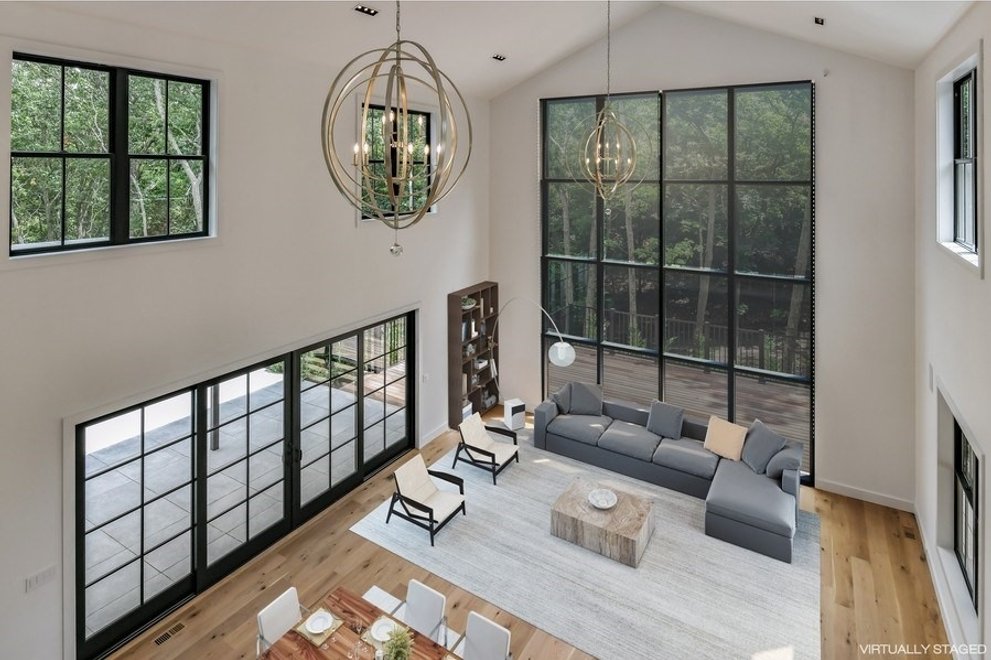
Eliminate narrow hallways and open up the kitchen, living, and dining areas to create more usable floor space
and allow easier communication between rooms for people who can’t see or hear well.
Mudrooms offer an opportunity to combine a closet and storage of outdoor gear with a welcoming entrance. Hooks and drawers control the clutter, and durable wall and floor materials stand up to all kinds of weather. The sliding screens at left provide flexible access (design by LDa Architects).
In private zones, place doorways and rooms opposite each other, which means less zig-zagging through the house and allowing better ventilation and daylighting. Consider 32-inch-wide doorways rather than standard 30-inch doorways. Thirty-two-inch doors are stock items and wide enough to accommodate a wheelchair, if necessary.
As shown here in a design by Deborah Pierce, Architect, wide aisles, halls, and doorways provide generous circulation, while pocket doors (at half-bath to the right) make greater use of floor and wall areas (no swing-space). Smaller functional areas such as a study and library fit easily into a widened hallway to enliven what would otherwise be little-used space.
Lighting
Minimize the use of recessed down lights because you have to stand on a chair to replace the bulbs, though LEDs are extending their life. Floor lamps and sconces are good alternatives.
Kitchen
The traditional 36-inch-high countertop is ideal for someone 5’8” to 5’10” but shouldn’t be a given for all kitchens, and certainly not for the entire kitchen, Pierce says. Incorporate counters at different heights with areas to sit while working. Sensory touch faucets or single-lever faucets are easy for a person with arthritis or weak upper-body strength to use. Consider a drain board cut into the countertop that sends water back into the sink, so water doesn’t pool on the floor and become a slipping hazard.
Choose a cooktop with easy-to read-dials or keypads placed on the front or side rather than in back, so you don’t have to reach over hot pots. The keypad control should have buttons that emit a sound when pressed so you know it got your message. Consider an induction cooktop, which reduces burn hazards and won’t catch fire if papers are accidentally left on the top. Use a wall oven if space permits, eliminating the need to stoop down to lift heavy pots in and out. When sourcing appliances, think about how well the company will serve you long-term. How easy will it be to troubleshoot when something breaks down?
Choose a counter-depth refrigerator with the freezer on the bottom, so that the appliance won’t protrude into the floor space and the food is at eye level. Consider buying a dishwasher with a white interior and chrome rack. Stainless steel interiors can make it hard to see things in dim lighting because there is low contrast. Choose cabinets with soft-close drawers that won’t won’t slam or bounce back. Concentrate storage in a pantry in easy reach and use fewer wall cabinets to allow room for windows and daylighting.
High windows in lieu of wall cabinets brighten this kitchen work area, and a roll-under cooktop makes room for a wheelchair without looking institutional (design by John Gordon, Architect).
Bath
Young people tend to fall around the tub and shower, older people around the toilet, Pierce says. Create baths that don’t stress the body by using fixtures such as a wall-hung toilet with the tank set into wall. Create towel storage near the shower and tub, and toiletry storage near the sink and toilet. The single linen closet is an old-fashioned idea, she says. Incorporate grab bars that feel good in your grip, especially near tub and shower controls. There are many attractive color and design options these days. Commercial grab bars are 1½ inches thick, but 1¼ inches is more comfortable for the hand to reach around, Pierce says.
“Thoughtful design is about understanding the range of conditions people may have over a lifetime—if not us, then the people who visit us,” she says. [All photos above by Kathy Tarantola]
Cheryl Weber, LEED AP, is a senior contributing editor to Custom Home and a frequent contributor to Builder.
To browse a collection of house designs with open plans click here.
