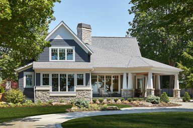
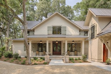
What is it about the model homes you usually see in new developments? No matter how hard designers try, it never quite looks like a family actually lives there. Picayune details sometimes conflict – there’s no way the couple pictured in a frame next to their bed had the children whose pictures line the hallway. Other times furnishings and accessories work too well together – few homeowners would have the taste or the money to put together a décor with elements that harmonize so perfectly.
A tour of custom and remodeled houses (not model homes) by Minneapolis architects earlier this fall brought to mind the gap between the fantasy life in models and the reality in most homes. The homes on the tour seemed more genuine and they also triggered ideas that could improve the model home experience.
The owner of one home on the tour had to deal with inherited furniture that made a statement independent of the room’s décor. Another owner who recently remodeled left a wood stove in the dining room (as shown above), a central location that gave it a better chance of heating more of the home. That’s a different kind of memory point altogether.
Owners of remodeled homes on the tour had to fight hard to make space work for them and made sacrifices
along the way. They settled for a claw-footed soaking tub with a hand-held showerhead – instead of a shower -- in the cramped bathroom. A picture rail just above the sink and tub adds utility. They adapted some areas
to new uses, like a laundry area added to an upstairs landing (shown below), and a reading nook with built-in bookshelves created under an attic dormer.
Real homeowners try to do the best with what they have. In one remodeled ranch, the architect tried valiantly to open up a closed floorplan, extending wood flooring into a new kitchen and enlarging door openings. Even so, the sight lines were far from perfect and added a charming quirkiness to the home.
Economics force most homeowners to make hard choices, like the architect-owner of a mid-century modern home on Lake Minnetonka. His first choice was to tear it down and build a new home. But the high cost drove him to remodel the existing structure instead. He carved out a piece of the roofline and turned it upside
down to create a butterfly roof that floods the great room with natural light. Widening the home’s footprint a few feet on each side – all that neighborhood covenants would allow -- enabled him to create a more spacious kitchen with a sitting/work space on one side and a screened porch adjacent to the master bedroom on the other.
Major remodels demonstrate the kind of things people really, really want in their home, since they can rarely afford it all. Judging by the major additions on the tour, a big open kitchen would have to be at the top of this list, or close to it. So would a screened porch, with a system that allows you to lower or raise the screens out of sight on balmy days.
You could feel the hand – and the practiced aesthetic -- of architects of custom homes on the tour. In one steel-and-glass contemporary, the architect repeatedly dropped sliding glass door tracks below the floor plane to create an improved impression of seamless outdoor/indoor space. Large windows with big panes contributed to the effect.
Custom homes, of course, often reflect a real homeowner’s sensibility, rather than the builder’s notion of what’s most likely to sell. For one home on the tour, the architect had to blend the desires of a husband who wanted a more contemporary home and a wife who wanted a Tudor. The result was delightful transitional architecture. The couple also wanted the home to be as sustainable as possible – regardless of paybacks. They searched out reclaimed beams and had them carved to use over the mantle and kitchen entry. They asked for a photovoltaic system large enough to power the home’s complete electricity needs.
Another custom home for an empty-nester couple contained features rarely seen in production homes. The master suite was separated from the great room by little more than paper walls, no big deal when a couple lives alone. One large guest bedroom included three beds for visiting grand children.
The scientific theory behind model-home merchandising – if there is one – is to make people imagine that they live in the home, bringing them one step closer to closing table. That’s often done by putting skateboards and electric guitars in the boy’s bedroom, throwing jaguar rugs on the floor of the master bedroom, and filling a bowl on the kitchen counter with plastic fruit. Maybe a better appoach would be to make it feel like a real home.
Boyce Thompson is the author of The New New Home: Getting the House of Your Dreams with Your Eyes Wide Open, and the former Editorial Director of Builder Magazine.
