By Boyce Thompson
If the kitchen is the heart of the house, its location, size, and configuration need to be at the center of a house plan purchase decision. If you are like most people, you’ll use the kitchen for much more than cooking. Parties often start in the kitchen – sometimes they never leave. The kitchen is a place to spend quality time with a spouse or kid, whether cooking, washing dishes, or doing homework. And with its many exciting surfaces, cabinetry, and lighting accents, the kitchen provides a great opportunity to make a strong, personal design statement.
Click here to browse our collection of kitchen floor plans.
For all those reasons, it’s rare to find a kitchen sequestered behind doors and walls anymore. In today’s house plans, the kitchen is typically out in the open, supported by an island, and intimately connected to living and dining spaces. In fact, an elegantly designed kitchen often becomes a focal point for other rooms in the house. Views from the kitchen – through windows and the house – are equally as important to consider. You’ll be spending a lot of time working there. The kitchen needs to be cheery.
Serious cooks need to look closely at the kitchen layout. Key work stations – the fridge, the sink, the stove – should be in close proximity. As you look at a plan, imagine taking vegetables from the refrigerator, washing them in the sink, cutting them on a counter, and dropping them in a steamer on a cook top. Check to see if there is enough counter top space to perform bigger tasks, like stuffing a roast or rolling dough. You’ll need even more counter and floor space if you like to cook with kids or a spouse. One cook can’t be in the way if the other needs access to the sink or garbage.
Kitchen islands, in addition to providing a second work surface, come in handy during parties. They are an ideal place to spread out hors d’oeurves and share a glass of wine with a neighbor. They are also great for spreading out big homework projects, grabbing breakfast in the morning, and wrapping presents. In fact, islands have proven so popular for tasks other than cooking that’s its common to see two in the most luxurious homes – one for preparing food, and a second for everything else.
Think about how your family would use an island. The exercise could determine its design.
 Plan497-46 features a large kitchen island and plenty of counter space.
The kitchen also needs to be close to the garage. That way it’s easy to bring groceries from the car. This kitchen (plan497-46 above) designed by Green Living succeeds on that score. It’s easy to imagine resting grocery bags on the island before putting purchases away in the large walk-in pantry. The plan is loaded with storage. There’s more room for cabinetry – especially around the sink and dishwasher – because the oven is located along the opposite wall. While working at the sink, you could check on your kids in the backyard.
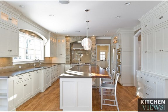
It’s hard to beat the styling of this classic white kitchen, with its grey counter tops, stainless steel appliances, tile back splash, and hardwood flooring. Shaker-style cabinets blend with molding and wall treatments elsewhere in the house. The style of a kitchen – counters, counter tops, and flooring – is something you could always change working with a builder and designer after you buy a plan. But it’s more difficult, and costly, to change the basic kitchen layout because of the way it works with other rooms. You are better off starting with a layout that’s close to what you want. All the better if the style also suites you.
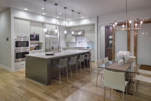 Plan 48-651 offers a bright and modern kitchen.
A small nearby work desk and two pantry closets add to the practical appeal of this more contemporary kitchen (plan 48-651 above). A sink on the large island commands a view through the dining area to an outdoor patio. From this vantage point you could keep an eye on guests as they circulate through the great room and patio. A generous pantry keeps clutter off work and serving spaces. A large built-in island has enough room for a family of four to enjoy breakfast together. Another advantage of separating the oven from the range – you get more storage space under the cooktop for pots and pans. Also, raising the range makes it easier to extract a turkey.
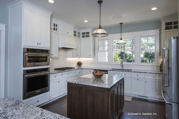 Plan 929-24 has a walk-in pantry that makes staying organized easy.
Windowed views can make or break a kitchen design. This plan by Donald A. Gardner Architects (plan929-24 above) provides a view from the sink through the front porch to the front yard. The view looking back through the house – through the dining room to a screened porch – is carefully considered as well. The kitchen’s location in the plan, around the corner from a family room, cuts down on noise transmission between the two rooms when work is being done.
An island in the middle of the work triangle creates an ideal work surface. A counter near the wall oven provides a spot to place a hot roasting pan. An exhaust fan over the cooktop blends with the cabinetry. Glass panels in the top cabinets help open up the tight space.
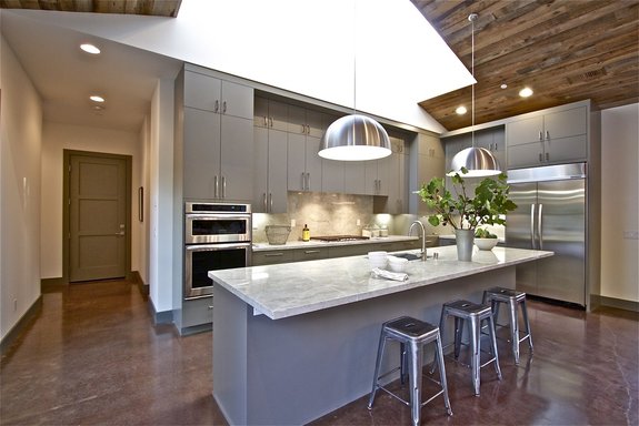 Plan 888-17 features a simple and open kitchen design.
As islands get bigger and more sophisticated, they need to be integrated into the overall kitchen design. The long horizontal island counter top in this plan by Nick Lee (plan888-17 above) shares the same stone surface as other kitchen counters. Likewise, cabinet pulls work in harmony with stainless steel faucets, appliances, and light scones over the brightly lit island.
Kitchens need both general lighting – in this case provided by pendants and a skylight – and task lighting. Under-counter task lighting around the sink makes it easier to read recipes, mix brownies, and tell whether pasta is ready. The varied lighting scheme adds appeal to a kitchen that’s on full display from the great room.
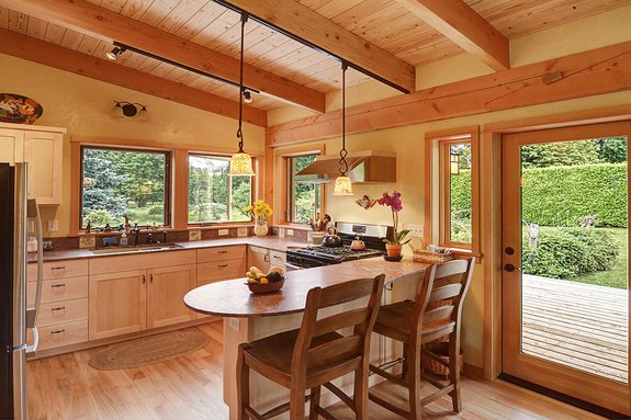 A peninsula island in plan 890-1 makes the kitchen space feel larger than it actually is.
In a small home, you really need to sweat the basics. The compact kitchen in this 800-square-foot plan by Nir Pearlson (plan890-1) makes the most of limited space. The layout starts with a classic work triangle – the sink, refrigerator, and range each occupy a wall. The layout provides a surprising amount of cabinet space, even with four windows that look out to the yard. But the best thing about the kitchen may be the way it picks up on interior details elsewhere.
Hardwood flooring and a beamed wood ceiling extend from the great room into the kitchen, with light-wood cabinetry that blends into the interior scheme. A paddle-shaped island with room for two juts out to partially separate the kitchen from the main living space.
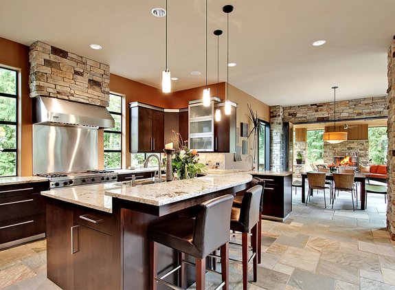 The kitchen in plan 132-221 flows seamlessly into the other main living areas.
It’s even harder to tell where the kitchen ends and other rooms begin in this plan by CornerStone Designs (plan132-221). Stone walls that grace living and dining spaces are picked up in the kitchen, and the stone floor in the kitchen runs throughout the house. Dark kitchen cabinets pick up on furniture colors in living and dining spaces. A raised counter on the curved island hides dirty dishes from view, a nice feature in a wide-open floor plan.
A curve in the island makes it possible to see who’s sitting next to you at the counter. The kitchen’s dark surfaces, including cabinets that appear to float over windows, reduce the glare from natural light.
Browse kitchen floor plans
Explore open layout plans

