Compact bathrooms are a challenge to make both efficient and elegant -- but it can be done! Here are some clever examples to use for inspiration as you think about modifying a plan to suit your needs.
Combine Functions
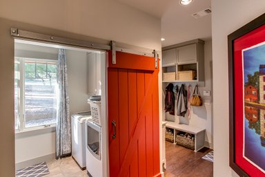
Architect Cathy Schwabe combined bathroom and laundry in her Cabin Plan 891-3, shown at the top of this post. The washer and dryer fit under the sink counter and turn the bathroom into a multi-functional space.
Shower Power
Architect Jonathan Feldman is especially adept at making small rooms feel spacious, as I have mentioned before. Here are two Feldman-designed bathrooms where the treatment of the shower visually expands the rest of the space.
In this example the shower rises the full height of the sloping ceiling and the transparent glass divider separates blurs the separation between it and the vanity. The tile extends to the ceiling, helping to unify the space for an uncluttered look.
A similar effect is achieved here, with the glass partition now rising all the way to the ceiling. The transparent surface of the glass bounces reflections into the shower itself, further deepening the sense of space.
Mirror, Mirror
Architect Sarah Susanka used a novel window/mirror combo to make a narrow bathroom seem larger in her Not So Big House Plan 454-3.
The mirror and the window draw the eye to the end of the bathroom, blurring the edges of the space beside the steps up to the tub.
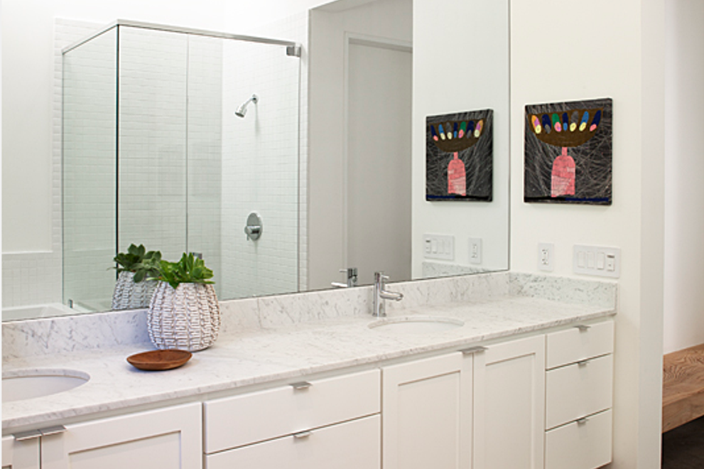
In architect Nicholas Lee's Ranch House Plan 888-3, the mirror backsplash magnifies the space, which is further emphasized by the skylit glass shower and white paint.
Nothing Wasted
Where there’s a little more space take a look at this example, with a platform tub and shower, that’s in our
Flexahouse Plan 445-3 by Nick Noyes. Though the drawing is schematic you can see the orderly simplicity of the arrangement — there is no wasted space.
Defined But Open
Or look at a platform tub and shower design by Turnbull Griffin Haesloop Architects.
The skillful use of small mosaic tile to delineate the room-within-the-room makes a fairly generous space feel even more open and bright and the skylight above the shower floods both the shower and the tub with light. This idea — of a wet corner — could easily be applied to smaller spaces.
