The recent two-day Monterey Design Conference, held in the historic, rustic, Julia Morgan-designed retreat kown as Asilomar at Pacific Grove between Monterey and Carmel on the California coast, brought a sold-out crowd of more than 800 architects together to discuss the current state of the building art. Session speakers ranged from so-called "Emerging Talents" to recognized leaders of the profession and "Tribal Elders" all talking about what, how, and why they do what they do and have done. This conference is all about showing how architects think.
They are problem solvers first, or as Oklahoma architect Rand Elliott said: "I am intrigued with projects that have no potential." Elliott was asked to design a gas station for Route 66 in Arcadia, Okahoma that would also sell a wide variety of soda pop, an ostensibly prosaic assignment. So he took cues from three things
associated with gas stations and exaggerated them: The typical gas station canopy became a 110-foot
cantilever sheltering a space that is for concerts as well as pumping gas. The typical soda pop
bottle became a 66 foot-tall roadside sculpture and sign -- recalling the playful work of Claes Oldenburg and Coosje van Bruggen. At night the carbonation is in the coils! The beverages themselves became a
form of stained glass as each type of drink gets organized by color and set against the window wall. The new landmark is called, naturally, POPs. Of course it takes an unusual client to pay for such a structure, and I wish we had learned more about him (photos courtesy Elliott + Associates Architects).
Architects can see new possibilities in everyday habits and furniture, the way Clive Wilkinson Architects did by reimagining a work table as a mobius strip-like surface that morphs into sheltering coves and
encompassing conference room hummocks in the office landscape designed for the Barbarian Group, an Internet advertising agency in London (photo courtesy Clive Wilkinson Architects).
Architects enjoy research into new materials and processes, as Doris Kim Sung of DO|SU Studio Architecture in Los Angeles does. Her interest in biology has led her to develop what she calls "smart thermobimetals and other shape-memory alloys, that can curl when heated to allow a building's skin to respond for purposes of sun-shading, self-ventilating, shape-changing and structure-prestressing." One example
is her glass panels containing an "organic shutter system" that opens or closes depending on the sun and changing temperature. She thinks a building should be able to move in response to climate. One question might be: how long will such a material last? But the concept is suggestive (image courtesy DO/SU Studio Architecture). In a similar vein,
Frank Barkow, of Barkow Leibinger in Berlin works with manufacturers to develop materials like the faceted reflective glass panels used to turn their new Trutec Building (part of an evolving digital media quarter in Seoul, Korea, shown here) into a three-dimensional collage or "kaleidoscope of infinite pixels." The idea was to have the building interact with a changing context, since the neighborhood is still being developed (photo courtesy Barkow Leibinger).
Architects are ofen comfortable with -- and even revel in -- sculptural abstraction, ambiguity, and contradiction. The San Francisco firm of Interstice Architects uses the term "brackish" to describe their interest in what they call "a third ecology" that mixes the disciplines of landscape and architecture.
One example is their new house on Vancouver Island in British Columbia, where no tree
could be removed, so house and forest weave together both horizontally and vertically. Even the firm's name refers to an in-between -- or interstitial -- space (photos courtesy Interstice Architects).
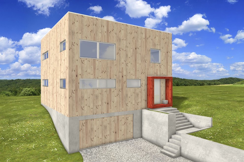
Architects tend to zero in on a particular feature of a program or site condition and heighten it in various ways, as Casper Mork-Ulnes does in his house near Mendocino on the Northern California coast.
The site offered three distinct views across the landscape, so he designed a house with three wings that each frame one of the vistas in a dramatic way -- like an elaborate, but also very simple, box camera. The living room wing is shown here; the exterior is at the top of this post (photo courtesy Mork-Ulnes Architects).
Another revelation prompted by this year's Monterey Design Conference is that Modern has a long history -- something that architects and the general public tend to forget. This point was driven home by architect Claude Stoller, a spry and energetic 95, whose eminent Bay Region firm, Marquis & Stoller, was active from 1956 into the 1990s. He also taught architecture for many years at the University of California at Berkeley. In conversation with architect and writer Pierluigi Serraino, Stoller recalled his early years studying with Joseph Albers at Black Mountain College from 1939 to 1943, then after a stint in the Army, with Gropius at Harvard's Graduate School of Design, who told his students "The new does not negate the old." This statement was a surprise to many in the Asilomar audience who might have assumed that early modernists always turned away from the past. Not so -- they were certainly selective in their use of history and context but they did not deny it. While at the GSD Stoller met Alvar Aalto, and later, on a drive west with his older brother the soon-to be eminent architectural photographer Ezra Stoller, he met Frank Lloyd Wright at Taliesin West in Scottsdale, and eventually came to Berkeley where he founded his firm. One of Marquis & Stoller's most
famous works is the Pence house in Marin County, California, a series of pavilions that appear to float above the trees (photo from They Chose To Be Different by Chuck Crandall, courtesy Populuxe).
In the end the conference brought home the idea that the best design is never done in a vacuum, but is always a process prompted by appreciating, analyzing, and understanding the complexity of everyday life.
