There are plenty of economic and sociological incentives to build smaller homes that economize on space. But another
equally good one is budgetary -- getting the most out of the home design you
pay for. Michael Fifield, Professor of Architecture at
the University of Oregon, presented a wide range of small home design tips at
this year’s American Institute of Architects conference. These are techniques
that every good designer employs. But they are great for a homeowner
considering a home design to know as well.
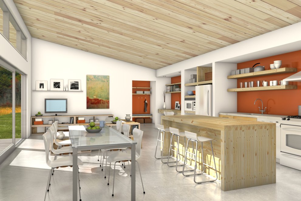
Fifield’s first piece of advice is to make a family room the heart of the house. Then consider using the great room, and other rooms, for multiple purposes. A good example might be Plan 497-57, shown at the top of this post, combining living, dining, and cooking areas. If you do include a dining room maybe it can double as a library. In similar fashion, with the addition of a day bed, your home office might make perfect accommodations for a guest.
Another good piece of advice is to consider using hallways for libraries, reading nooks, or guest sleeping. Hallways, and wall sections, may need to be widened to include shelving. Fifield, who also has a private architectural practice, showed a variety of large alcoves used as windows seats, some big enough to hold a
mattress. Here are some examples from Houseplans.com, such as the hall/mud room/office in
Sarah Susanka's Plan 454-12; and window seat/bookcases in the entry hall of her Plan 454-13.
One secret to effective small home design is to avoid wasting space for circulation. When circulation spaces are inevitable – like a stair landing – consider multiple uses. Perhaps the alcove in the landing is big enough to sleep a guest or take a nap.
Using vertical space is another good way to save floor area. Bunk beds in a child’s bedroom, and
upper cabinets in the laundry for bulk storage, are two good examples. Space under stairways can be carved out for storage, shelving, and reading alcoves (example above by Kerf Design). A
memorable example is the sleeping nest by the late architect Charles Moore at his famous condominium at The Sea Ranch, which is a platform over the living area: a room-within-a-room (photo courtesy Michael Fifield).
One of the best “tricks” for making homes read larger is creating strong indoor/outdoor
relationships. Sliding or folding window walls that lead outside are one obvious way to do this, as shown in Fifield's own design for a live/work studio, above (photo courtesy Michael Fifield). They literally break down the separation of indoor and outdoor spaces. And here's an example of a
very small house that lives larger thanks to having the main rooms open to a long deck, Plan 484-4.
But another thing to consider is the location of windows within a room. Orient them to create views of the garden and sun. "Providing a direct view to the outside when entering a room extends the
perception of the size of the room." Placing windows around the corner of a room increases the sense of diagonal space, as shown here in Plan 498-6 by architect Matthew Coates.
By the same token, designing an outdoor room, or even a covered deck, creates the impression that
homes are bigger. If they serve as transition spaces to a garden, all the better, as shown in this cabin Plan 931-1, by Butler Armsden Architects. Another trick to creating the perception of bigger rooms is to use so-called dissolved corners. "Borrow visual space from adjoining rooms by not enclosing all rooms."
Rooms also appear bigger when their surfaces, especially the walls and ceilings, are articulated. Varying ceiling heights is one tactic. “Consider built-in shelves, drawers and closets that can provide
storage, visual diversity, and extension of room size.” Open shelving extends the depth of a room and an open joist in the ceiling visually extends the height of room (as in this image from Plan 924-3 by Truoba).
Boyce Thompson is the author of The New New Home.


