Everybody’s in the Kitchen
It’s just as we suspected — when we’re at home we spend most of our time in the kitchen and family room. Now there is documentation to back up that assumption, along with this compelling diagram, thanks to a fascinating new study by the Center on Everyday Lives at the University of California at Los Angeles (love the Center’s name!).
As reported in The Wall Street Journal and the LifeEdited Newsletter, the study followed 32 middle class LA families as they used their homes over four years. The diagram (courtesy LifeEdited) is just one of many results: the dots indicate the location of the parents and children in one family every ten minutes over two weekday afternoons and evenings. According to the WSJ: “The researchers found that 68% of the family’s time was spent either in the kitchen or in the family room, near the TV and computer.”
There’s just one lonely lingering dot in the dining room — though I notice quite a lot of practice time at the piano in the living room. “Although it’s been said many times many ways” — to quote a Christmas carol — the dining room’s a dinosaur. And used mostly just on feast days.
Other fascinating findings: the more objects that are attached to the refrigerator, the more objects per square foot in the house overall. (Yikes!). And the typical garage had no room for the car what with storing 300 to 650 boxes. (Yikes again — though in my case the score for the match between automobile and storage containers is a tie.) The complete results of the study are published in the bookLife at Home in the 21st Century.
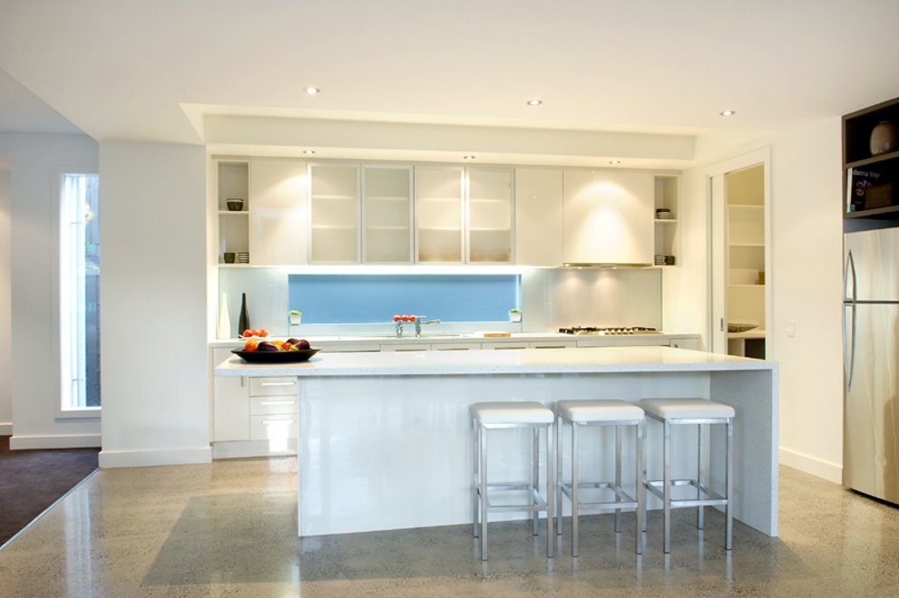
Thinking about where people actually spend the most time at home made me look for kitchens and family rooms that multitask without seeming cramped (you need room for all those dots…) The photo at the top of this post is of a remodel by architect Malcolm Davis. The kitchen, dining and breakfast areas have separate identities but still occupy one overall space. You can feel apart — and pet the Dalmatian — while still being together.
Architect Tom Lawrence designed this kitchen to incorporate a handsome and spacious booth, which
creates the effect of a room-within-a-room. The high up-sloping ceiling and corner window wall add to a sense of spaciousness within limited square feet.
In a house in coastal Maine by Elliott + Elliott Architecture the granite outcropping used as hearth
dramatically divides activity areas without cutting one space off from the other.
Among our newest exclusive plans are several by Australian architect Leon Meyer that would allow many “dots” to congregate in the kitchen/family zone.
Plan 496-19. To see more click here.


