For thousands of years we have had rules that govern dimensions of trim pieces. These rules, chronicled in books by the likes of Vitruvius, can insure that any trim (and baseboard sizes) we install is both functional and pleasing. So rather than just putting up the standard 2 ¼” colonial casing and 3 ¼” colonial baseboard, let’s take a look at some of these rules (and explore house plans with photos for inspiration).
Click here to explore our collection of house plans with photos.
The 7 Percent Solution
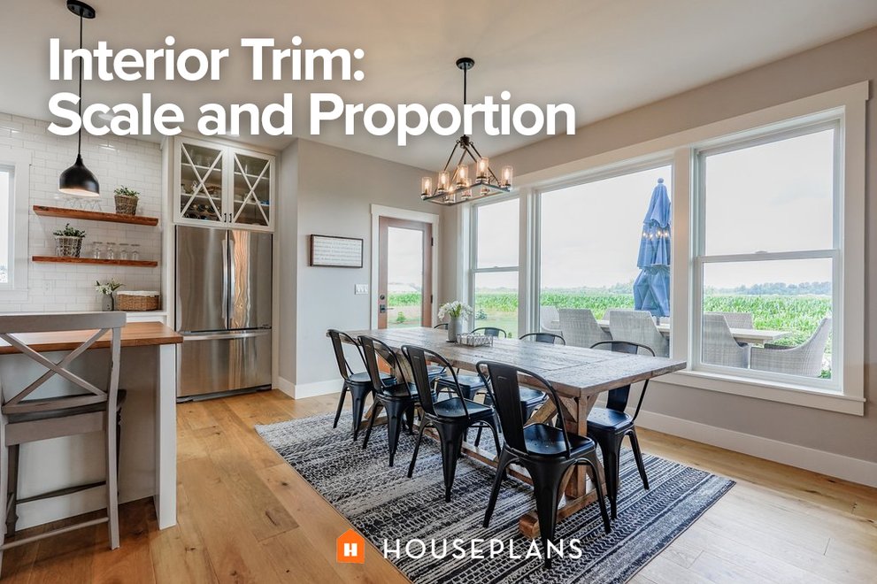
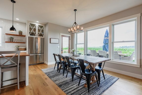 Plan 1070-104 sports simple baseboards in the kitchen/dining area that feel clean and modern.
How tall should my baseboards be? A baseboard height that’s approximately 7% of the wall height provides for a solid and definable base without being too big. The overall proportion of baseboard to wall height will be comfortable and pleasing. So in a room with a 9 foot high ceiling, a baseboard that’s about 8 inches tall works.
The 50 Percent Rule
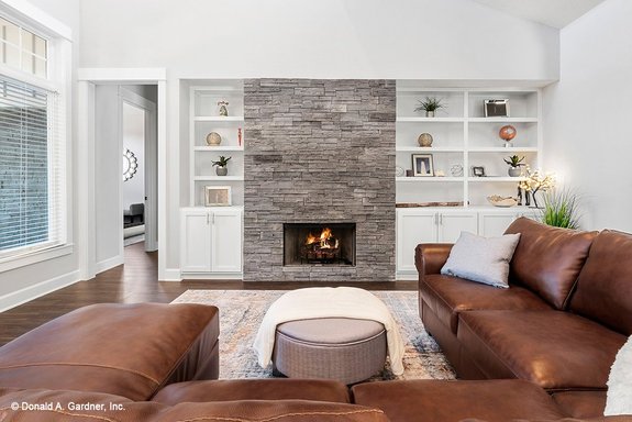 Plan 929-1001 features vertical trim around the cased opening to the hallway that has less heft than the baseboards.
Generally, vertical trim elements such as door and window casings should be smaller and have less heft than baseboards. So I've found that a good rule of thumb for sizing window and door casings (or door trim sizes) is to keep them at about 50 percent of the height of the baseboard. The 50% rule is a good starting point for sizing a crown as well. However, there are many variables, such as profile and whether or not there will be a picture rail that go into the sizing of a crown.
Given these variables, sizing a crown isn't as straightforward as you might think. I like to purchase foot-long pieces of different sizes and profiles and construct mock-ups of the crown in the room. In fact, because most trim is readily available and inexpensive, this is a really good process to use for selecting all of your trim elements.
The Rule of Thirds
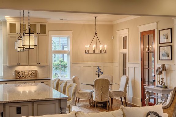 Plan 928-10 boasts a stylish chair rail in the dining room.
Installing a chair rail, with or without wainscoting, will divide the vertical plane — the walls — into multiple areas. If you want to make the room feel taller, place the chair rail one third of the way up from the floor. If, on the other hand, you’d like to make the ceiling feel lower, place a rail higher up in the wall and finish the area above the rail differently than from below the rail. This was a favorite trim detail for the Prairie School architects such as Frank Lloyd Wright, as illustrated in the dining room at the top of this post (learn more about the rule of thirds at Apartment Therapy).
Explore more interior-trim looks with these house plans with photos.
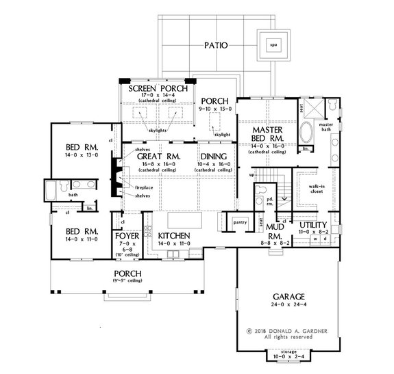
Modern Farmhouse Plan with a Screened Porch
Enjoy a modern open floor plan with this design
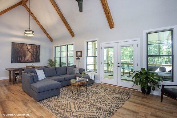 Plan 929-1053 features nice interior trim in the great room.
This 2,187-square-foot design features a modern open layout and sweet farmhouse styling. With all the main living areas on one level, it’s easy to get around the home, making it a great choice for aging in place or chasing around little ones. The screened porch offers a bright and cheerful outdoor living space (check out these screened porch ideas from HGTV). A bonus room upstairs can be finished for even more room. Don’t miss the big kitchen island or the master suite’s convenient walk-in closet that opens to the laundry room.
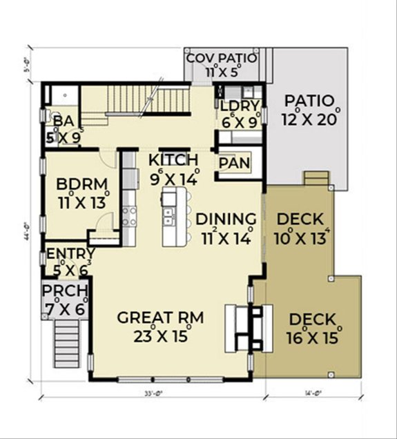
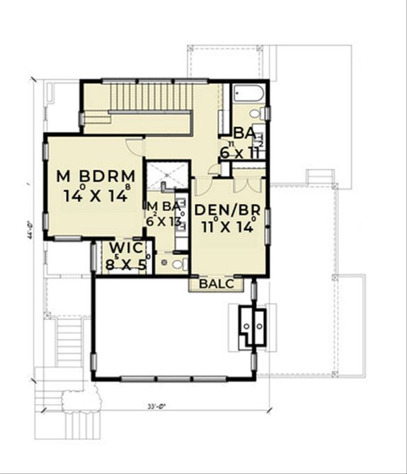
Striking Modern Style Home
Capture the view with this sleek design
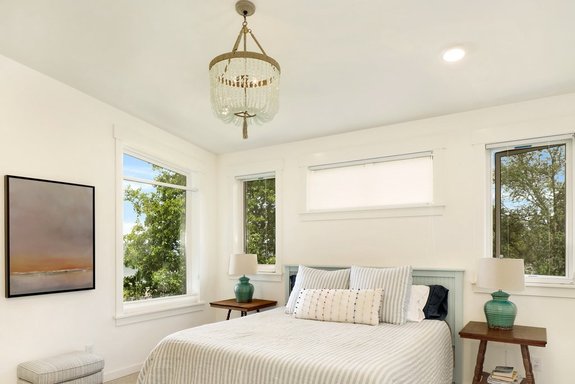 Plan 1070-7 features great trim details throughout.
Got a lot in a beautiful location? This striking modern home will capture the view with tons of windows. Elegant and chic, this clean-lined modern design features an open layout that flows from the great room into the island kitchen and out to the deck for immersive outdoor living. The master suite enjoys impressive views and invites you to unwind in the big shower (plus check out the double sinks).
A Modern Cottage with a Relaxed Vibe
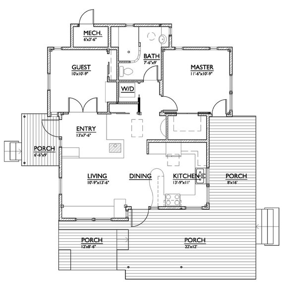
You’ll find lots of wood trim work in this small house plan
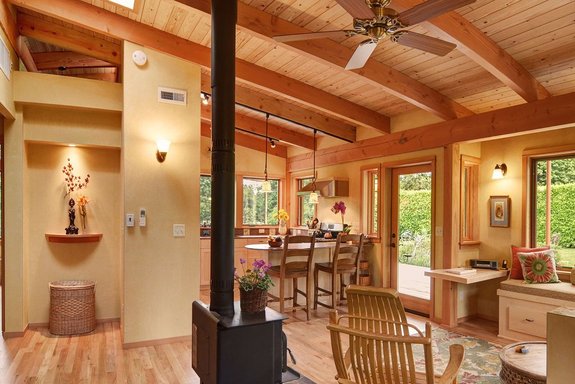 Plan 890-1 makes the most of a small space.
A big wraparound porch extends the outdoor living space for this small, cool house plan. The kitchen's snack bar overlooks the living room for a relaxed vibe. A walk-in closet gives you lots of handy storage. Don’t miss the cool wood details throughout.
Exclusive Modern Farmhouse Design
This house plan offers room for a home office
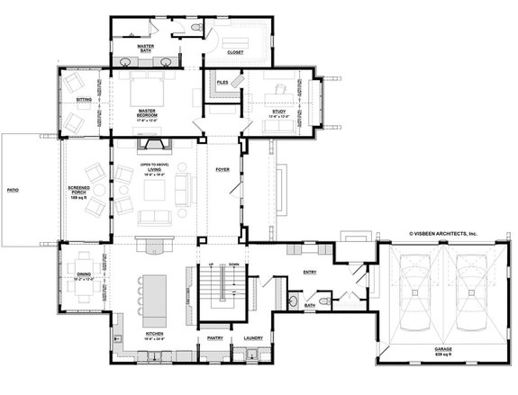
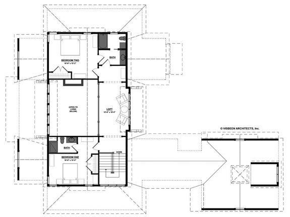
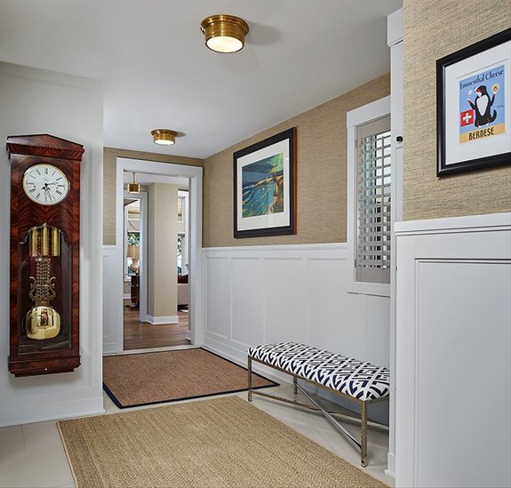 Plan 928-14 feels elegant with a classic chair rail.
This exclusive modern farmhouse (the Rosewood by Visbeen Architects) shows what luxury really looks like today. We're talking about relaxed, functional spaces that give your family plenty of elbow room. Work from home? A study could be used as a home office or homeschooling space (it even offers a generous file closet). Check out the enormous kitchen and walk-in pantry (organize your pantry with these tips from Decorated Life).
Explore more house plans with photos.
