Consider the backsplash. As the kitchen has transitioned from a utilitarian room into the home's social gathering hub, this seemingly mundane component is now the backdrop. “The backsplash is a real opportunity to add a highlight to the kitchen. Designing a great one isn’t just about picking some tile and making a pattern—it means careful thought about color, texture, material, and careful coordination of appliances, outlets and other features,” says Houseplans.com architect Matthew Coates of Seattle-based Coates Design.
Do you prefer glamorous and distinctive, or calm and subtle? To help you make this key design decision, we turned to the experts--interior designers and architects who create beautiful environments for their clients and are very aware of the practical considerations. Here are some of their personal favorites.
Mixing It Up With Marble
A perennial favorite for countertops, marble adds a sense of old-world refinement and luxury. It has become a backsplash of choice not only for traditional kitchens but extremely contemporary spaces. It is important to seal it to protect it from splatters (as homeowners have found out the hard way). While Carrara marble is better known, Calacatta marble is often seen in kitchens because it tends to be whiter and have more distinctive veining.
For one of his custom residences, Houseplans.com architect Jonathan Feldman of San Francisco-based Feldman Architecture worked with interior designer Lisa Lougee to create a large tapestry of marble, as shown in this photo by Joe Fletcher. “We selected the same Calacatta marble that was used on the island counter because we wanted to unify the kitchen with only a few materials, and because we love the subtly bold drama of this stone,” he says. To showcase marble’s spectacular veining, the backsplash continues to the underside of the cabinets.
For a recent project in Palo Alto, California, designer Melanie Coddington of San Francisco- and L.A.-based Coddington Design used Ann Sacks’ Athens Silver Cream marble tile in a herringbone pattern.
Between the Quartzite countertop and the marble is a thin border of horizontal tile from Waterworks.
L.A.-based architect Barbara Bestor, who designs super-hip stores for Trina Turk and others, uses marble alongside mirrored panels to give her kitchens the liveliness of a restaurant or bar.
Placing a mirror behind the range gives this kitchen by architect Barbara Bestor a sense of excitement and energy.
Classic with a Twist
If you’re a fan of white subway tile, you’re in good company. But if you’d like to try something a little different, consider fish-scale tiles, a contender for favorite backsplash of New York-based designers Azadeh & Kermit Westergaard of Made By Two.
One example is this White Moroccan fish-scale tile from Mercury Mosaics, an artisan tile company based in Minneapolis. It has the neutrality and classic feel of white subway tile, yet has an added touch of whimsy without being too specifically a ‘look,’” say the Westergaards. “By remaining understated with the backsplash, you can add more to a kitchen or bathroom with accessories that personalize the space. This keeps the look classic and timeless, while allowing for warmth and personality to come through in the details."
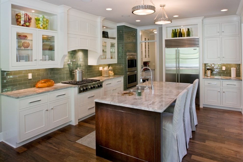
Tile has the advantage of coming in a nearly infinite range of hues and tones, like this elegant example, using
horizontal green tile in a subway pattern behind the cooktop and around the oven housing; in Plan 901-1 by SketchPad, Inc. The kitchen won a 2015 Howie Design Award.
The Craftsman Ceramic Tradition
Today's ceramic artists offer a wide variety of possibilities, such as the dramatic Arts & Crafts-inspired work of designers Richard Keit and Mary Kennedy of RTK Studios in Ojai, California.
The "Spanish deco" wall mural made with their hand-glazed tile vividly complements the vintage range. Extending across the counter and up the wall, it turns the cooking zone into a theatrical backdrop -- like a kind of stage.
Houseplans.com architect Sarah Susanka used a medallion or plaque tile called Ravello by Encore Ceramics
as the key kitchen accent behind the cooktop in her Not So Big Showhouse in Libertyville, Illinois, which is Plan 454-12.
Clear and Simple
Architects love to use glass, and the kitchen is no exception. In a kitchen designed by Matthew Coates, the backsplash is the view outdoors, thanks to a large window over the sink.
“We also put in a modest backsplash that coordinates with the countertop material, and raised the windowsill above the counter for long-term care and maintenance,” says Coates.
If a window is not an option, consider backpainted glass. “It captures and reflects light beautifully, and is seamless, modern, easy to clean, and can come in any color you like,” says architect Neal J. Z. Schwartz of San Francisco-based Schwartz and Architecture. “We are also experimenting with placing images and wallpaper behind the glass for a more decorative look."
He enlarged a photograph of the grasses outside this Sonoma home and placed it behind glass to create an evocative backsplash. Photography by Matthew Millman.
Houseplans.com architect Cathy Schwabe used a green honed limestone with a food grade
mineral oil finish -- matching the counter -- for the kitchen in her Cabin Plan 891-3. She doesn't have a favorite material but offers practical reasons for having a backsplash in the first place: "I do believe in splashes – and have to fight for them with some interior designers and even some builders more than I would expect. When using a sponge to wipe up a surface that has a side/edge against a wall – I want to hit something that can take the sponge and not have to worry about getting the wall dirty, nor having to deal with the inevitable problems with the silicon joint that would be used for the counter to wall joint."


