Bathrooms don't need to be huge to feel spacious or inviting. It's how you arrange the various functions -- sink, wc, shower, and/or bath -- that's important. Here are some ideas to help you achieve a spa-like effect.
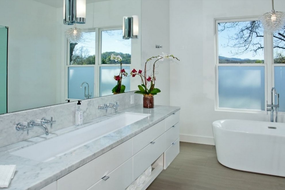
The master bath shown above, for a house designed by architect Nicholas Lee, which is Plan 888-18, turns the tub into a sculptural element that complements the serenely simple paint and material palette. The long double sink adds a note of surprise while still keeping everything as simple and uncluttered as possible.
In another Nick Lee design, shown below, transparency almost makes the shower disappear, expanding the
apparent size of the room. The skylight turns the shower into a large lantern or "light chimney," adding to the overall glow.
The minimalist approach to materials and fixtures, including mirrors, creates a restful effect, as shown in in Plan 496-21 by Leon Meyer. The mirrored vanity wall reflects the clear glass shower,
which, with the surrounding white walls and white tile backsplash, and elegant thin vessel sinks, creates the airy look. The wood counter adds warmth.
In Plan 48-544 the design frames and accentuates the view into the garden: the large window beside the platform tub is the focal point. Shower and toilet are hidden, keeping the space uncluttered and adding
privacy. Both bathrooms offer the perfect spot to rejuvenate after a long hard day -- or to prepare for the day ahead.
The master bath in Plan132-226, below, shows how effective under-mounted sinks are in creating an uncluttered look while at the sam time maximizing counter space.
The use of symmetry, a muted color palette, and simple linear drawer pulls also help create a restful composition, as shown here in the master bath of Plan 892-10.
The tall central cabinet, subtly striated fronts, and long horizontal metal pulls set the relaxing mood -- no wonder there's a bottle of champagne on the table by the tub!
Architect Jonathan Feldman is particularly adept at coaxing an airy functional elegance out of smaller bathing spaces. Here, the deep window shelf, minimalist materials and fixtures, and natural light coming
from two directions give this tiny bathroom a measure of serenity (photo by Paul Dyer, courtesy Feldman Architects).
Gale Steves, the best-selling author of Right-Sizing Your Home: How To Make Your House Fit Your Lifestyle, offers the following helpful tips for getting the most out of your bathroom and making it both more functional and more spa-like:
- "Before you start the planning process, take an inventory of all the things you currently store in your bathroom. How many towels and bath linens do you want to be handy? Could some of them be housed nearby?
- Toiletries can occupy a lot of storage area. That, too, should be considered in the drawers of the vanity or built-in bath cabinet space. Also how will you handle toiletries in the shower or bath areas?
- To get control of your grooming electronics, look at a bath cabinet that allows you to plug in directly rather than leaving them on the counter.
- Storage above the vanity should always be in easy reach. Mirrored cabinets (built-in or wall-mounted) come in many sizes to accommodate most spaces.
- Bathroom safety is important because this room can be a hazard, no matter what your age. Slip resistant surfaces, particularly in the wet areas, and grab bars in tub and showers are easy to add during the building process. They are more difficult afterwards.
- Comfort height toilets raise the height of the seat to 17 to 19 inches. They are easier and safer to use as you get older. A future-proofing investment you can enjoy now.
- Eliminate shadow or glare with good lighting; think about night lights or sensor lights to avoid stumbling in the dark."
