The jury for the annual Chrysalis Remodel Awards met last month in Atlanta and this year's winners offer a look at national trends. Categories include whole house makeovers, specific revamps of kitchens and baths, and historic renovation. Here are the trends that caught my eye.
The Islands Have It!
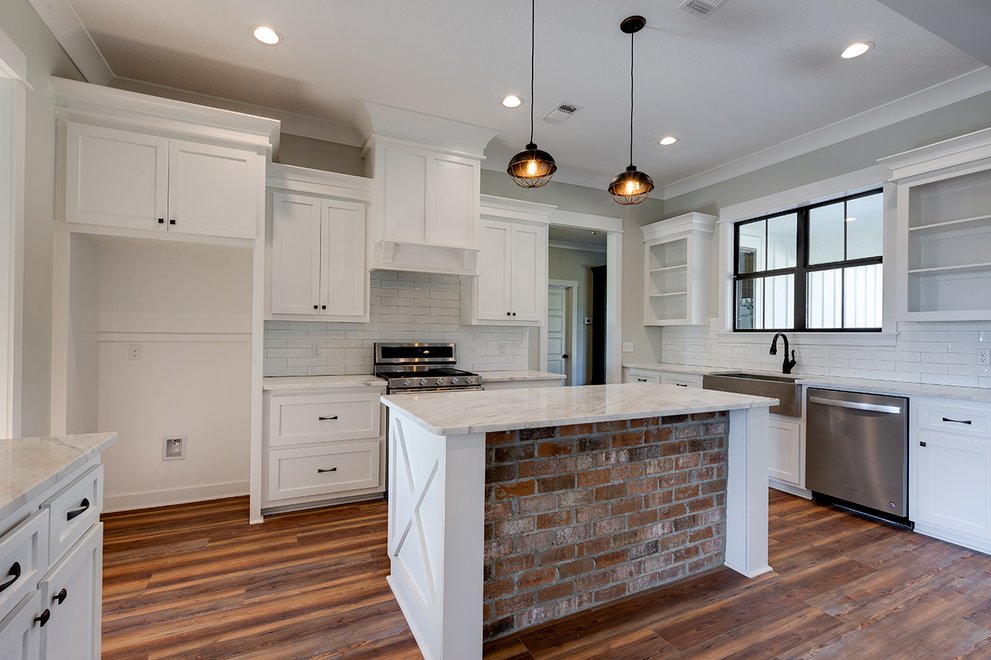
Everyone wants a more efficient and beautiful kitchen and this Illinois example by Normandy Remodeling shows just how multifunctional such a space (shown at the top of this post) can be, with its two level island for food prep and informal meals, along with appliance garages to hide clutter, ample counter space, an eye-catching tile backsplash over the range, and a handsome family entry with storage cubbies and hooks for coats.
In Massachusetts, Cummings Architects designed a new kitchen (part of a whole house historic renovation)
around a large multipurpose island. The backsplash is brick that was unearthed during
the remodel and re-sawn as veneer for a nod to the history of the house.
The new kitchen is in the artfully understated addition to this historic home dating from 1760. Though shingled to differentiate it from the yellow clapboard of the original house, simple gables, porch, and window frames relate to the earlier structure, making the complete house look as though it grew naturally over time -- which it did!
Invisible Additions
GTM Architects answered the question of how to expand a Maryland house with distinctive
Colonial style in another way: they made the addition appear to disappear. New bedrooms, family room and guest suite now occupy the space of the old garage, as you can see in the before and after photos above. The seamless addition looks as though it was always part of the original house. Expanding on the Colonial theme, a new front portico framed with double columns now shelters guests from weather and adds curb appeal.
Adding a floor to a one story house is a common problem, which gets harder if the original house has strong
visual character, like this vintage Craftsman bungalow in North Carolina. Here Fryday & Doyne Architecture & Interior Design took their cue from the repeating rooflines, as you can see here,
deftly inserting the new second floor in such a way that it doesn't look like an afterthought.
Barn Doors & Bathtubs
The sliding barn door has long been a favorite of designers for its space-saving efficiency and rustic charm, and was a feature of many projects entered in this year's competition. One of the most striking examples is in
this Massachuusetts master bath remodel by Adams & Beasley. The barn door hides or
reveals the soaking tub, which is itself behind glass for aural privacy, allowing views across the bedroom to the window.
Despite rumors of its demise, the soaking tub still seem to be a desirable feature for the master bath, and it often appears next to a walk-in shower as here in a Washington design by Lawson Design Studio.
The solid sculptural shape of the tub acts as a foil for the transparent shower. Sandblasted glass up to shoulder height preserves privacy while flooding the bathroom with daylight. The pebbled floor adds a naturalistic spa-like look while forming a pleasing texture that's good for massaging the feet.
Basement As Wild Card
The usual functions that go into basement remodels are recreation rooms, guest suites, and utility rooms but
here is an example of something completely different: the craft and home schooling suite! An enviable variety
of built-ins for different activities, from gift wrapping to art class, are shown here. Note the clever "paper roller" tables. This Missouri basement by Mosby Building Arts is now a grandchildren/grandparent paradise.
