[Note: this is an update of an earlier post.] As you tour houses, browse room layouts, and dream about building your own home, it's helpful to be aware of common design flaws that can mar the experience of living in a home. Here are twelve plans that successfully avoid common design pitfalls.
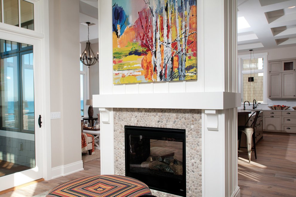
1. Dead-end single use spaces like living rooms that stop a natural flow and create bottlenecks when entertaining. A doorway or other opening in the wall lets you move through the room without having to back-track. The two-sided fireplace between the living room and the kitchen-dining area in the photo at the top of the post, which is from Plan 928-11, and in another example, below in Plan 908-1, defines each space without blocking one off from the other.
Flexibility is also important: a small living room or study might function as a temporary bedroom as long as there is easy access to a bathroom.
2. Pay attention to indoor/outdoor integration, i. e., easy connections to sheltered outdoor space or the back yard. Look for convenient doors to a patio or porch: the outdoor connection allows a house to expand in good weather, connect to the site and landscape, and prevents it from feeling like a prison.
2. Pay attention to indoor/outdoor integration, i. e., easy connections to sheltered outdoor space or the back yard. Look for convenient doors to a patio or porch: the outdoor connection allows a house to expand in good weather, connect to the site and landscape, and prevents it from feeling like a prison.
3. Some vestigial, non-functional front porches are not large enough for sitting, so make sure the plan you want has a porch that's at least 8 feet deep to allow for furniture placement.
Plan 137-107 The front porch is deep enough for outdoor living -- which also adds curb appeal.
Plan 137-107 The front porch is deep enough for outdoor living -- which also adds curb appeal.
4. Overlarge kitchen islands can literally become the "elephant in the room," so analyze how much space you actually need for casual dining and food prep: if it's a buffet island, space for three or four stools is usually enough.
Plan 479-11 The island is multi-functional and in scale with the kitchen.
5. The "Goldilocks Problem" is when Entries, Hallways, and Family/Great Rooms are too big or too small or have ceilings that are too high. It's all about proportion and practicality -- a two story entry that makes you feel you have entered the bottom of a well does not make for a pleasant arrival and is wasteful. On the other hand, low ceilings can make smaller rooms feel cramped and are especially regrettable when stairs seem to disappear into them. A stairway should not make you want to duck before you take the first step. So, look for plans where room height is proportional to room size, and where the stairway is a light source with a double-height ceiling over it and a window at the upper landing or high in the stair wall.
6: Insufficient daylight thanks to too few windows, or windows on only one wall, create glare and a cave-like feeling and the sense that the room has been buried. A great room with only one window is a great mistake!
Don't buy a house with a great room that only has one window. Or consider expanding the great room to create a window bay so that you will have daylight coming from at least two sides. Wall-washing skylights can make a room feel taller and more spacious.
Plan 901-1 A great room with daylight from more than one side feels more spacious and welcoming.
7. Look for a comfortable garage-to-kitchen progression. Circuitous routes make carrying groceries and other supplies more of a chore than necessary.
Plan 48-642 Efficient garage-to-kitchen access means no convoluted circulation.
Plan 48-642 Efficient garage-to-kitchen access means no convoluted circulation.
8: Sculptural bathroom or "vessel" sinks may look appealing but remember that they will have numerous edges and crannies to clean, often hogging the counter space. Consider under-mounted sinks or integral sinks (that is, sinks that are integrated into the counter itself) to maximize counter space.
9. In the bathroom, some inexpensive sliding doors on tubs and showers can induce claustrophobia instead of cleanliness -- not to mention bruised elbows. Use shower curtains instead, or replace the tub with a walk-in shower.
Plan 132-228 A walk-in shower feels more spacious than a tub-shower.
Plan 132-228 A walk-in shower feels more spacious than a tub-shower.
10. UPLans with unnecessarily high or complex roof configurations and a lot of gables, hips, and bumps can make for poor architectural proportions and increased potential for leaks. Plans with simpler silhouettes will be less troublesome.
Plan 500-3 A simpler roof profile avoids the potential for more leaks.
11. Details are important: Instead of cutting costs by lowering quality in windows, doors, hardware, flooring, which are the most visible and touchable elements of a home and establish its character, reduce the square footage. This is a way to lower costs instead of compromising on materials and fixtures.
Plan 888-3 Invest in space and light instead of quirky features.
12: When building from stock plans, avoid making modifications in the field without consulting an architect or designer. He or she can make modifications that won't compromise the original design.


